Base Layer: Component Library & Design System
Designing for Consistency: A Flexible KYB Tracker for Baselayer.
Context
Role: UI/Systems Designer
Type: Component Architecture Study
Tools: Figma (Auto Layout, Tokens)
Designing for Efficiency: Targeting a 42% reduction in decision time for Risk Teams.
This project was designed for the Baselayer application to support financial compliance workflows. In the high-stakes world of Know Your Business (KYB) verification, risk teams need to process dense data tables rapidly without error. The interface required a rigorous system to manage verification statuses like "Pass," "Fail," and "Pending" clearly and consistently.
High Stakes, Low Consistency In financial compliance, ambiguity is dangerous. A Risk Officer needs to scan hundreds of rows of data to verify business entities. The existing ad-hoc designs suffered from:
Visual Noise: Inconsistent padding and generic colors made it hard to scan for "Fail" states.
Scalability Issues: Variable data lengths (e.g., long company names) broke the layout.
Engineering Debt: Developers were hard-coding values, meaning a simple style update required refactoring the whole table.
My Approach
I moved away from "designing screens" and focused on "architecting a system." I used a Tokens-First methodology to ensure the component was bulletproof.
1. Semantic Token Architecture I abandoned generic naming conventions. Instead of Green-500 or Red-500, I defined tokens by their intent.
Why: If regulations change and "Failed" needs to be high-contrast Orange instead of Red, I only update the token once.
Implementation: Defined
Status/Pass,Status/Fail, andStatus/Pendingat the root level.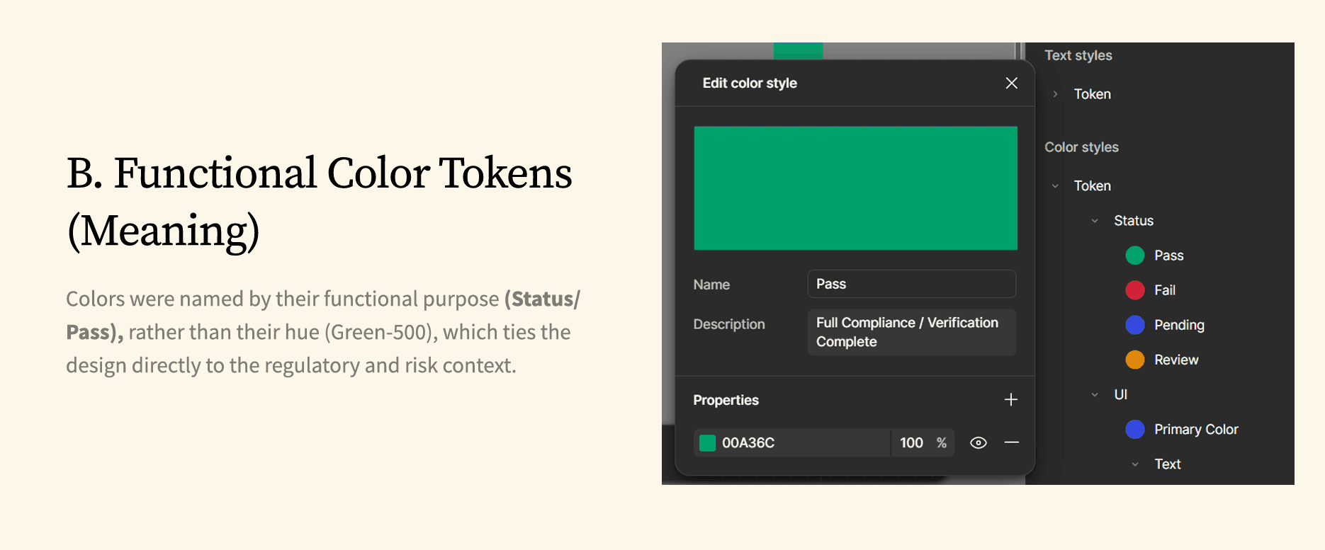
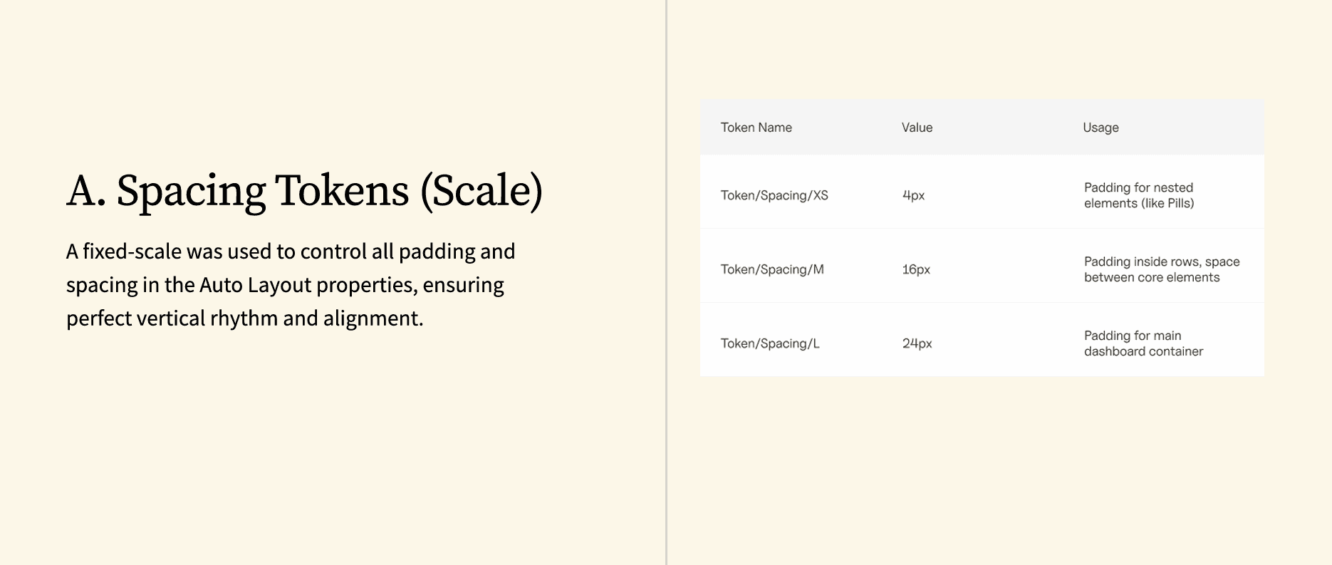
Strict Spacing Scales To fix the visual rhythm, I enforced a hard grid.
4px (XS): Internal padding for nested elements (like Status Pills).
16px (M): Standard padding between table columns.
24px (L): Container padding.
3. Component Nesting Strategy I treated the table row as a "Master Container" holding smaller, independent sub-components.
The Atom: The "Status Pill" (handles color logic).
The Molecule: The "Data Cell" (handles text wrapping).
The Organism: The "Tracker Row" (handles alignment).

The Results
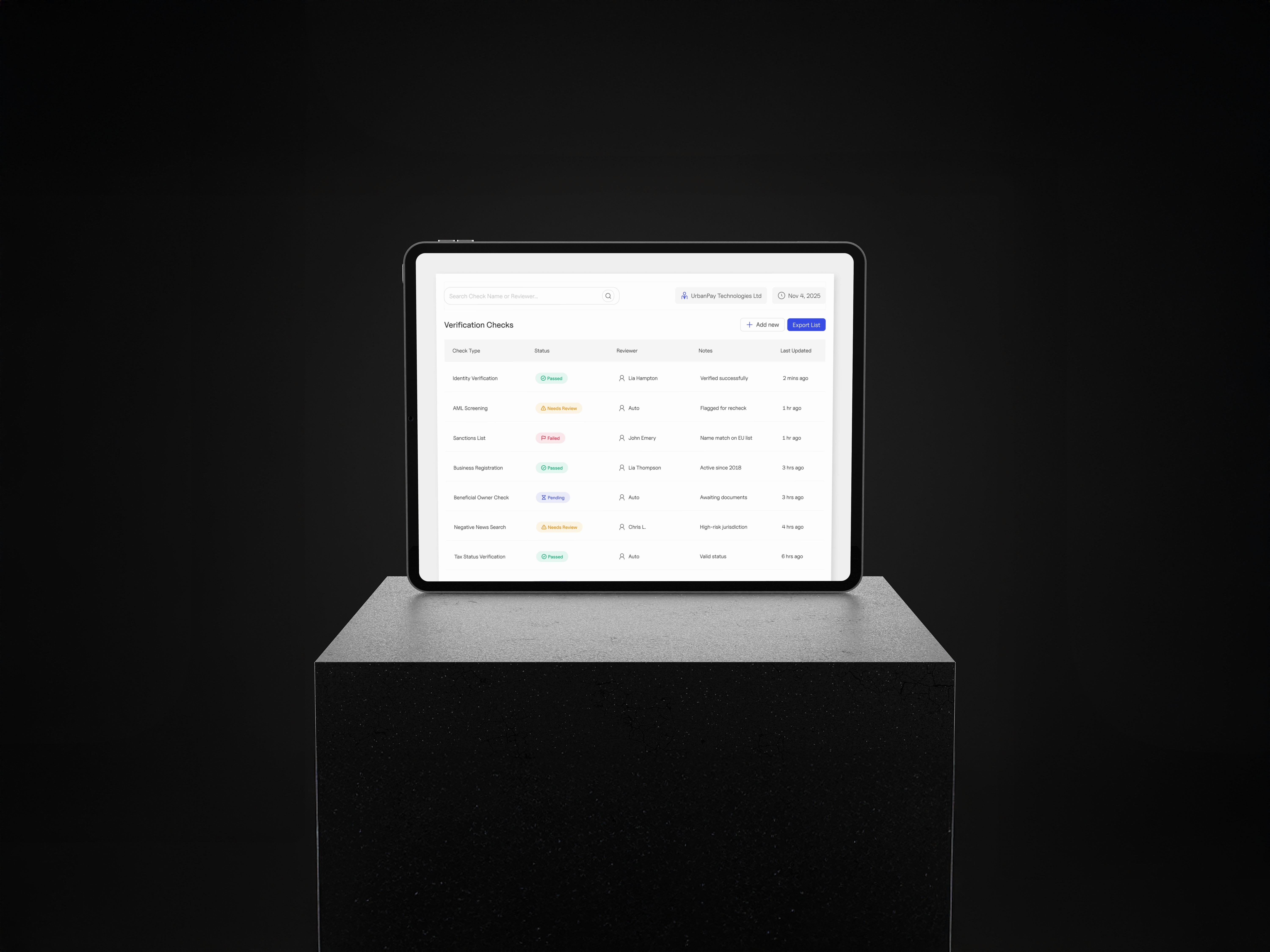
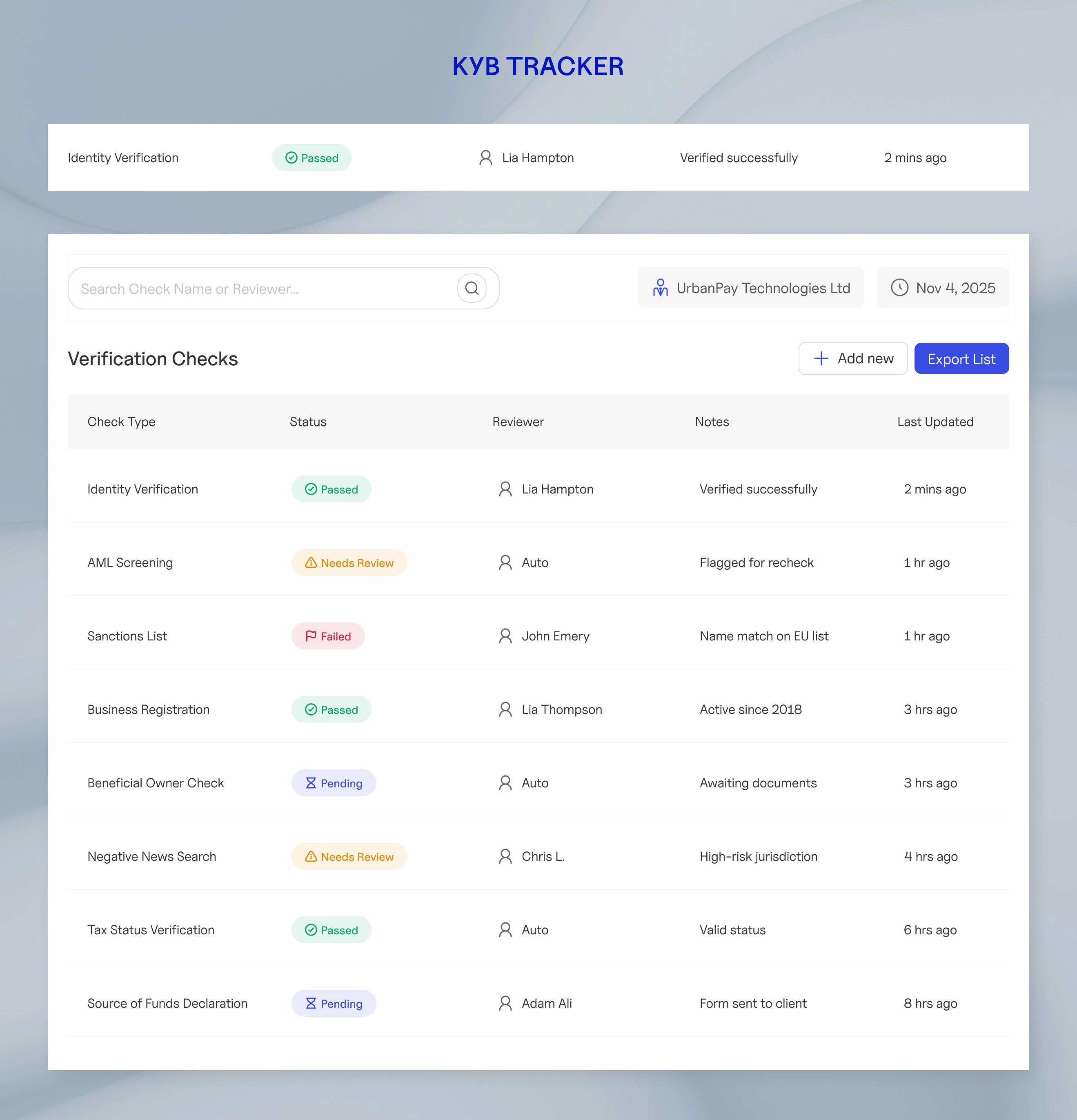
The Verification Checks Table I delivered a high-fidelity, responsive data table designed for rapid scanning. The layout is organized into four strategic columns:
Check Type: Clearly identifies the regulatory category.
Status: High-contrast pills (Pass, Fail, Review) allow agents to spot risks in milliseconds.
Reviewer & Notes: A fluid column that combines the assignee and context, expanding to fit long text without breaking the grid.
Last Updated: Ensures data freshness is always visible.

What I Learned
Good systems make you faster I learned that taking time to build a solid structure upfront actually saves time later. It lets the team ship features quickly without breaking things.
Name things by what they do Calling a color "Status Fail" instead of just "Red" makes a huge difference. It means if the branding changes later, the system doesn't break.
Real data is messy Perfect dummy text is a trap. I learned to build components that stretch and adapt, so the design doesn't break when real, long content gets dropped in.
Clear notes save everyone time The best design is one that developers can actually build without guessing. I learned that writing clear instructions is just as important as drawing the pixels.