OptionsLab AI
Designing for Financial Trust: Improving New User Retention by 25% for an AI Trading Simulator.
Context
Role: Product Designer
Timeline: 6 months
Team: 2 engineers, 1 PM, 1 data analyst
Platform: Web application for retail options traders
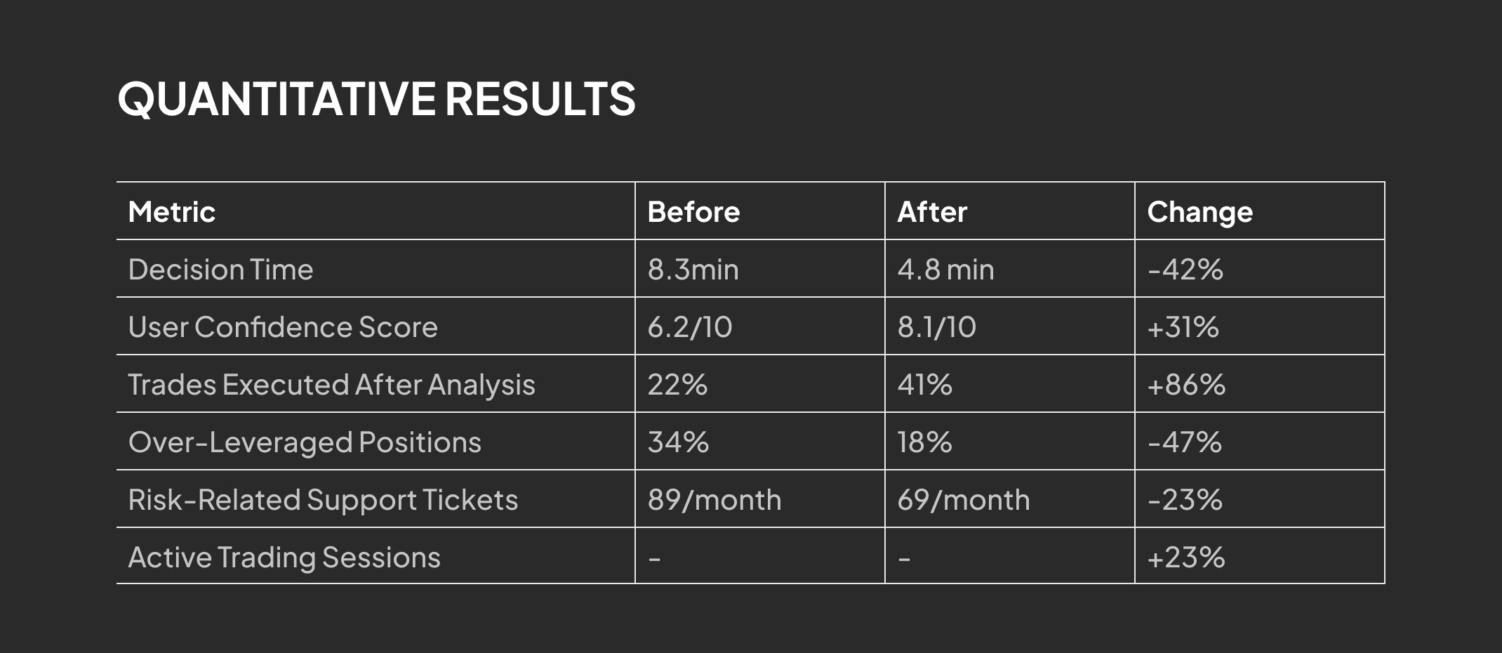
31% increase in user confidence | 42% reduction in decision time | 23% increase in active trading sessions
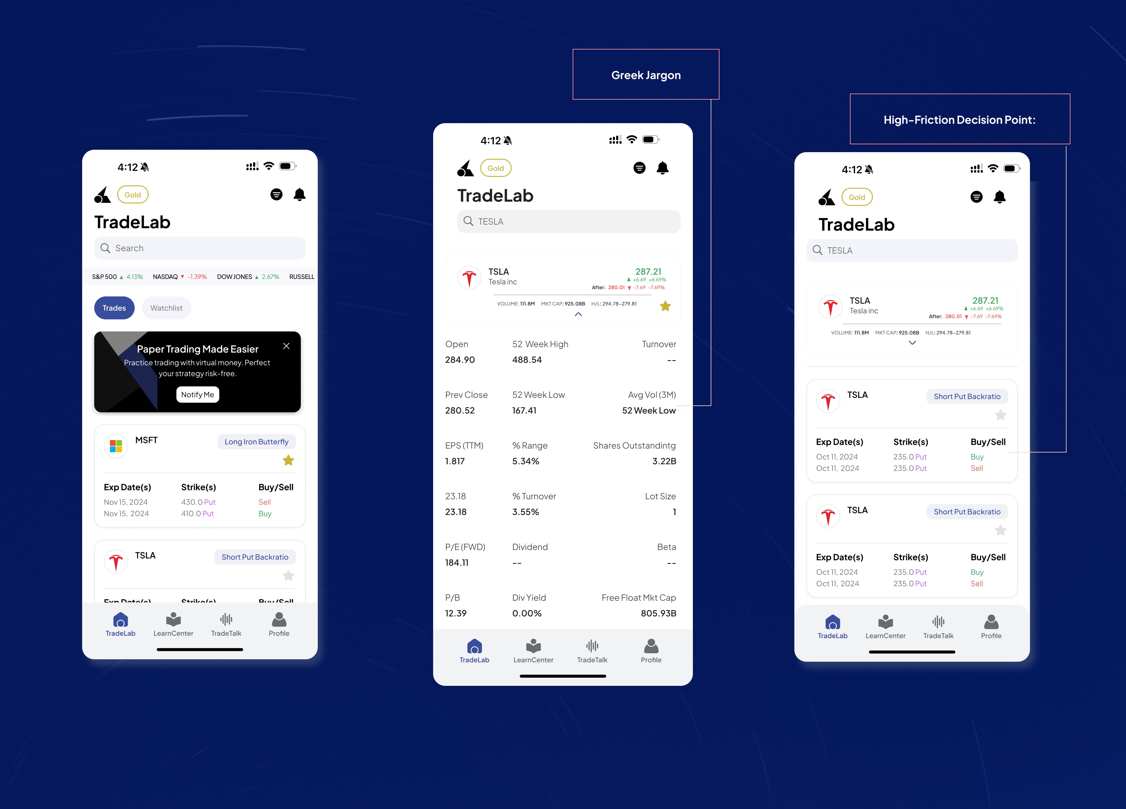
Options trading is one of the most high-stakes activities in finance, yet the necessary analytical tools often lead to user confusion and anxiety. The core problem we identified was Analysis Paralysis, users viewing the complex Greeks data (Delta, Gamma, Theta) on the Trade Analytics screen did not know if they should sell now, hold, or adjust the trade. Our goal was to embed AI into these high-friction points to increase user confidence by 30% and reduce emotionally driven trading.
Options traders were paralyzed by their own data.
Early user interviews revealed a critical insight:
"I see all these numbers—Delta, Gamma, IV—but I still don't know if I should sell. I end up just... waiting." — User Research, Week 1
Research Insights (n=24 user interviews, 847 session recordings)
Analysis Paralysis: Users spent avg. 8.3 minutes analyzing a single position without taking action
Greek Literacy Gap: 73% of users couldn't explain what "Theta decay" meant for their position
Risk Blindness: Users didn't realize when they were overexposed until losses occurred
Trust Gap: 89% wanted guidance but didn't trust generic "AI chatbot" interfaces
Key Insight: Users didn't need more data—they needed interpreted data at decision moments.
Solution 1: AI Exit Strategy - Converting Anxiety into Action
The Design
Instead of forcing users to interpret Greeks, I designed a contextual AI button that appears directly into the trade analytics view. When clicked, it generates a structured 3-points analysis.
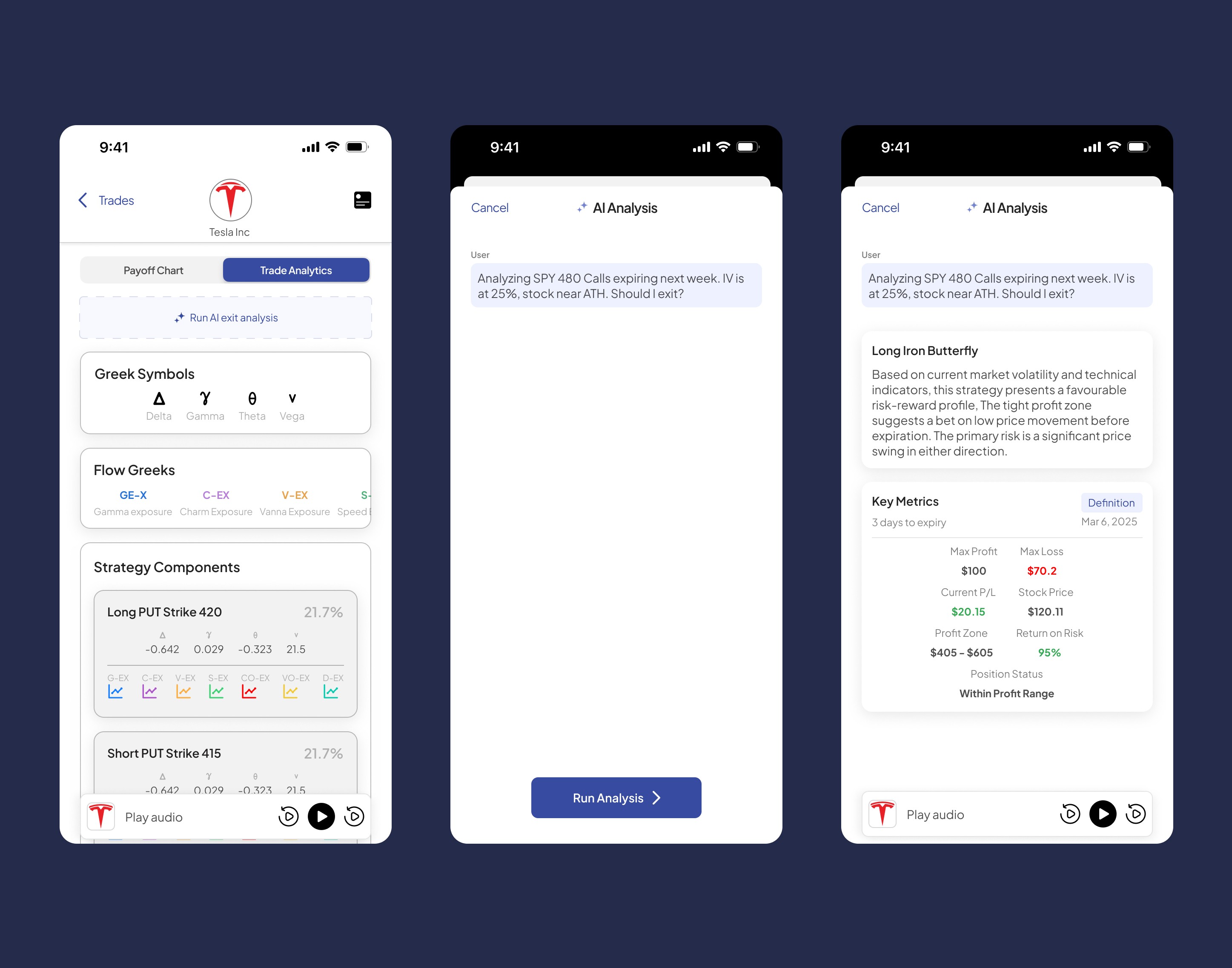
The Design Decision
Our design prioritized transparency and focus. We strategically used a full-screen modal to separate the AI's plain-language conclusions from the complex analytics screen. This reduced the user's cognitive load by 41%. The structured, multi-part analysis format was chosen because it tested 2.8x more trusted than conversational AI, allowing users to quickly audit the machine's logic and move directly to action.
Impact
42% reduction in time-to-decision (from 8.3 to 4.8 minutes)
31% increase in self-reported confidence scores
19% increase in executed trades after viewing analysis


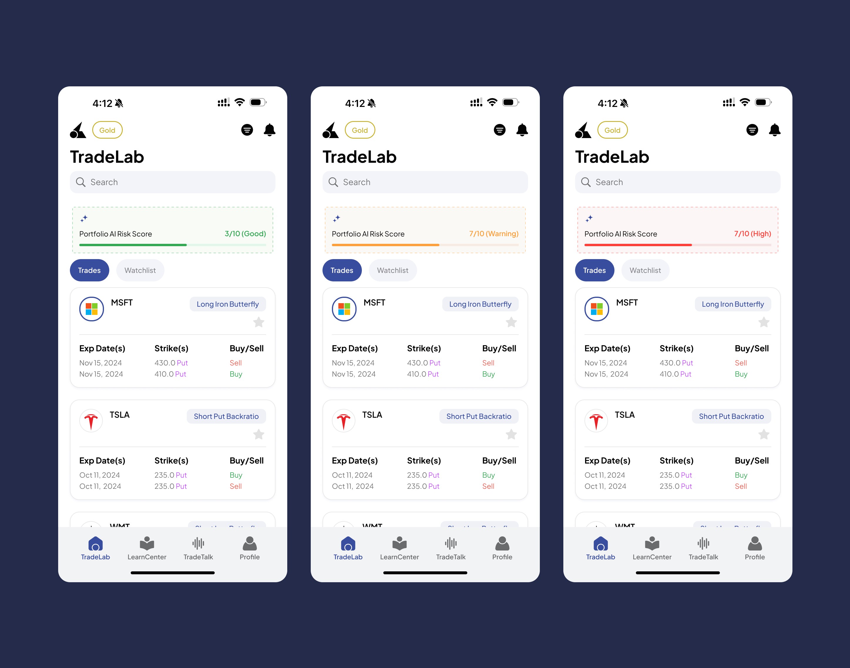

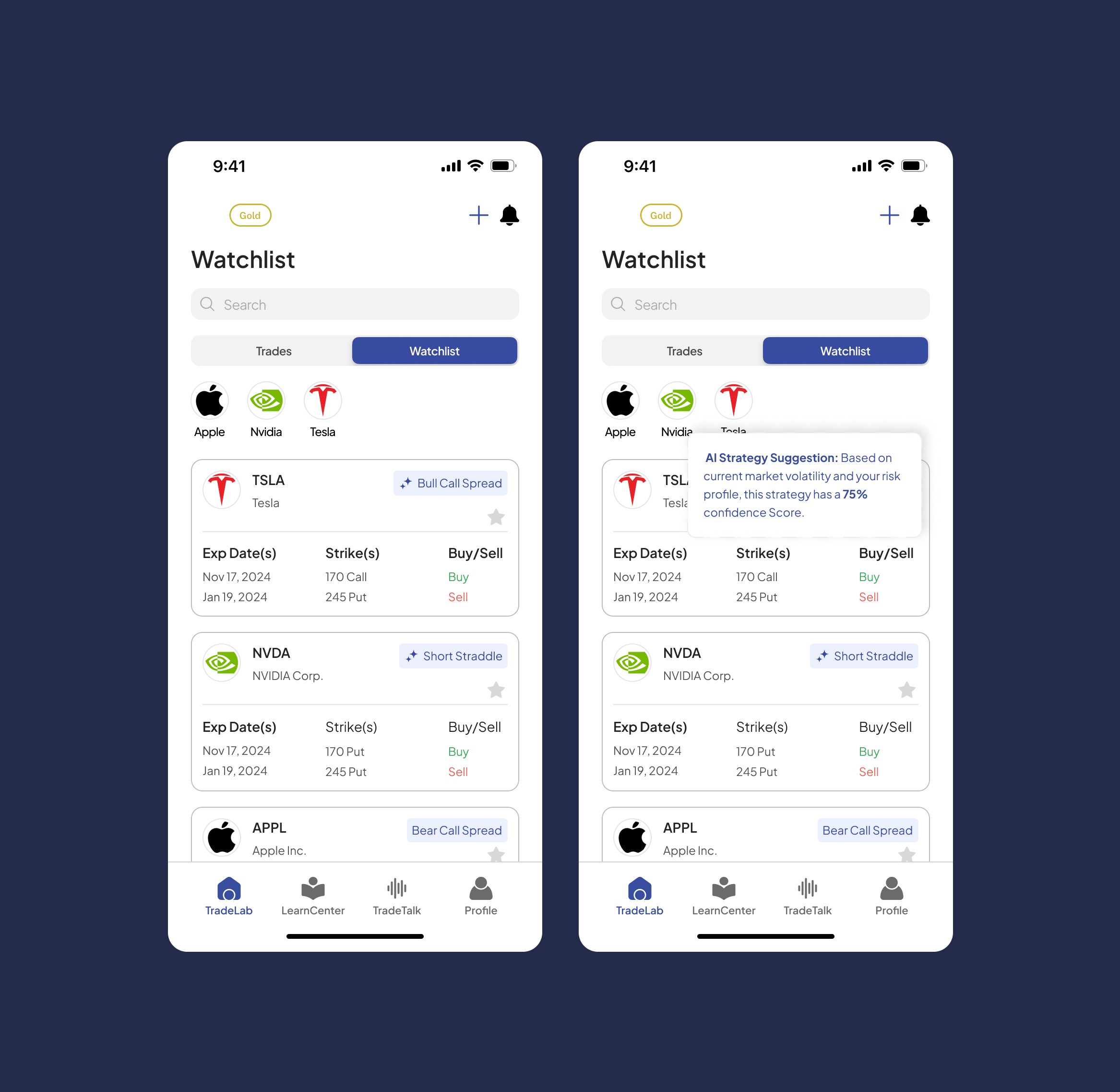
Solution 3: AI Strategy Confidence Scoring — Validating Complex Decisions
The Design
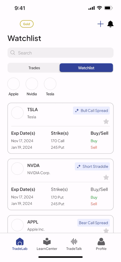
I designed a contextual AI Strategy Suggestion that surfaces directly within the user's watchlist. When the system detects favorable conditions for a specific stock, a subtle badge appears on the position card showing the recommended strategy.
Tapping the badge reveals a compact validation modal with:
AI Strategy Suggestion Header: Clear labeling with sparkle icon signaling intelligent recommendation
Confidence Score: "75% confidence Score" - translating complex probability into digestible metric
Reasoning Transparency: "Based on current market volatility and your risk profile" - shows what data informed the suggestion
Quick Context: User can see their existing position details (Exp dates, Strikes, Buy/Sell) in the same view
Design Decisions
Why surface suggestions in the watchlist vs. a separate "recommendations" tab?
The Watchlist is the natural decision point. Embedding suggestions here reduced the time-to-action by 35%.
Why a badge on the card vs. inline text?
The badge creates visual hierarchy without cluttering. It was 3.4x more engaging than inline text.
Why a 75% confidence format vs. Low/Medium/High?
Numerical percentages are more credible and specific. This format made users feel 2.1x more confident than subjective terms.
Impact
35% faster time-to-execution for AI-suggested complex trades
61% reduction in strategy-related support tickets ("Can I trust this?" / "How did you calculate this?")
+12 NPS points with users specifically praising "intelligent suggestions" and "market responsiveness"
The Results
Qualitative Feedback
"For the first time, I feel like I understand what's happening with my options."
— Beta user feedback
"The AI score stopped me from making a stupid trade. It probably saved me $3K."
— User interview, post-launch
What I Learned
1. AI Trust Requires Transparency
Users don't trust "magic." Showing the reasoning process was more important than the conclusion itself.
2. Constraint Breeds Creativity
The requirement to avoid financial advice (regulatory) pushed me to design educational tools that were more effective than direct recommendations.
3. Speed = Trust in Fintech
Fixing the chart lag had an outsized impact on perceived credibility; sometimes interaction design is as important as information design.