iTourNC MVP - a B2B SaaS AI Startup
Redesigned the MVP that helped iTourNC onboard 20+ early users and pitch a functional AI-powered prototype to investors.
Context
Role: Product Designer (Full-time)
Timeline: 6 months (MVP development)
Team: 2 engineers, 1 founder/PM, 1 marketing lead
Platform: Web application for real estate virtual tours
MVP launched with 20+ early agents | 3-sided marketplace designed from scratch | Projected 60% time savings for agents
Real estate agents are drowning in operational overhead. With 30-50 active clients per agent and limited hours in the day, agents can't provide personalized attention to every prospect—resulting in lost deals and burned-out agents.
Agents wanted to scale, but personalization doesn't scale.
Early conversations with 12 real estate agents revealed a painful contradiction:
"I know each client wants something different, but I can't give 30 people personalized tours every week. I'm just showing everyone the same 5 properties." — Agent interview, Discovery phase
Research Insights (n=12 agent interviews, 8 enterprise stakeholder meetings)
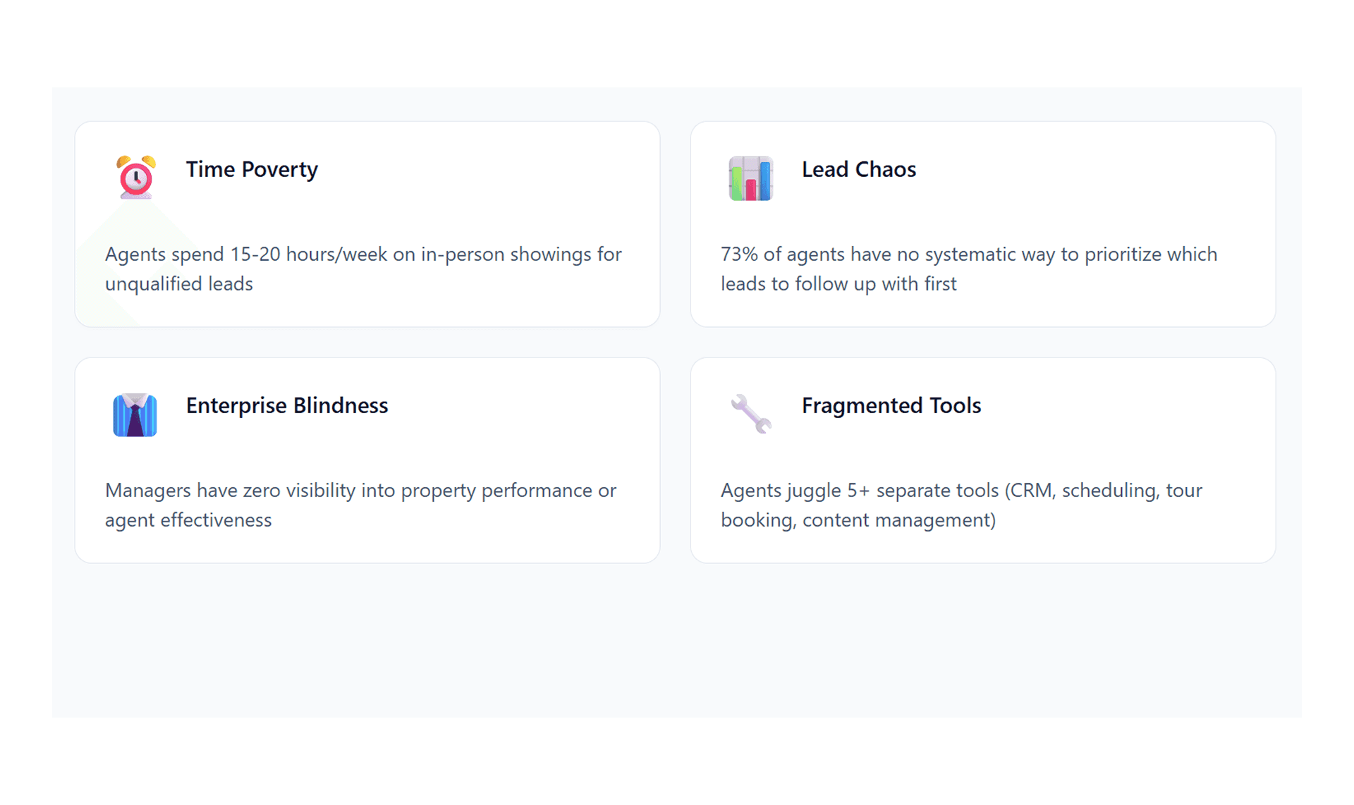
Time Poverty
Agents spend 15-20 hours/week on in-person showings for unqualified leadsPersonalization Gap.
73% of prospects want customized tours, but agents can only offer "one-size-fits-all"Lead Chaos
Enterprise managers have no visibility into which properties are generating interest or why.
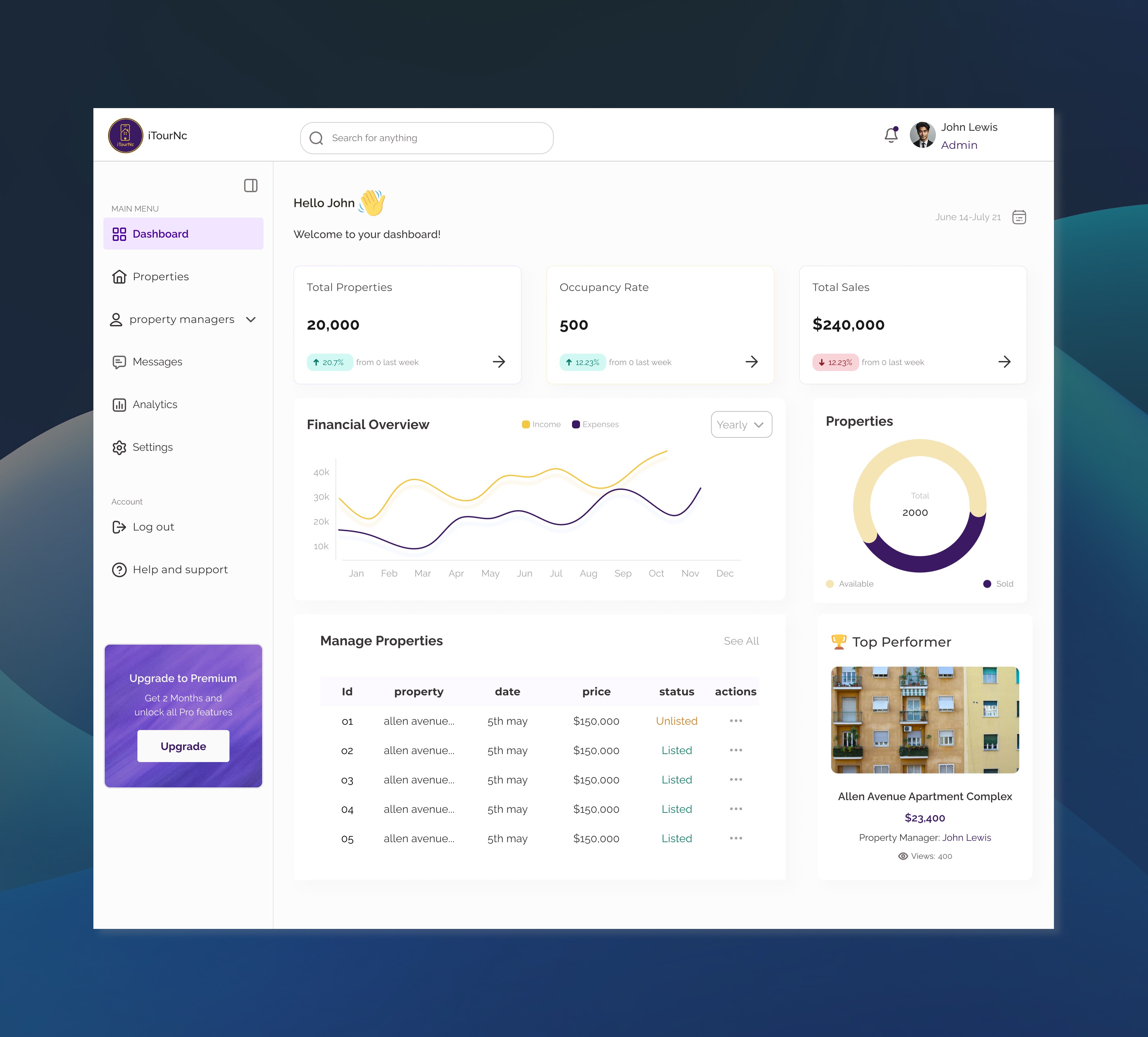
Solution 1: Enterprise Command Center — Portfolio Intelligence for VPs
The Design
I designed a comprehensive enterprise dashboard that aggregates data across the entire portfolio, giving VPs a birds-eye view of performance:
Key Modules:
Portfolio Overview:
Total properties, active tours, lead conversion rates
Month-over-month growth metrics
Tough performing property
Property Performance Grid:
Each property card shows: views, tour completions, engagement time, lead quality
Media image and 3d tours
Active leads interested in the property
Property manager in charge of the property
Engagement Analytics:
Sales growth and customer growth per month
Best performing admins
Best Performing Properties
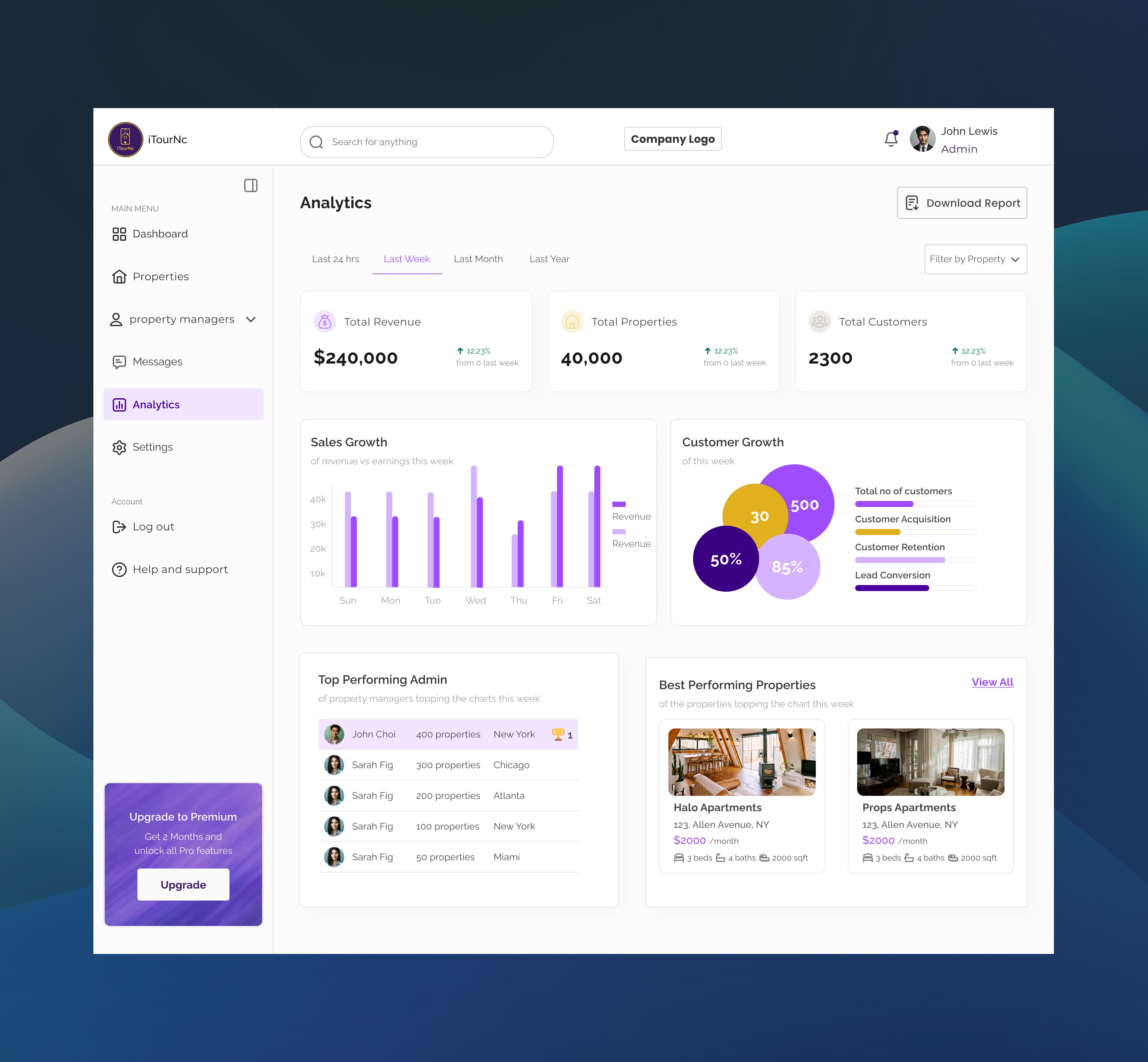
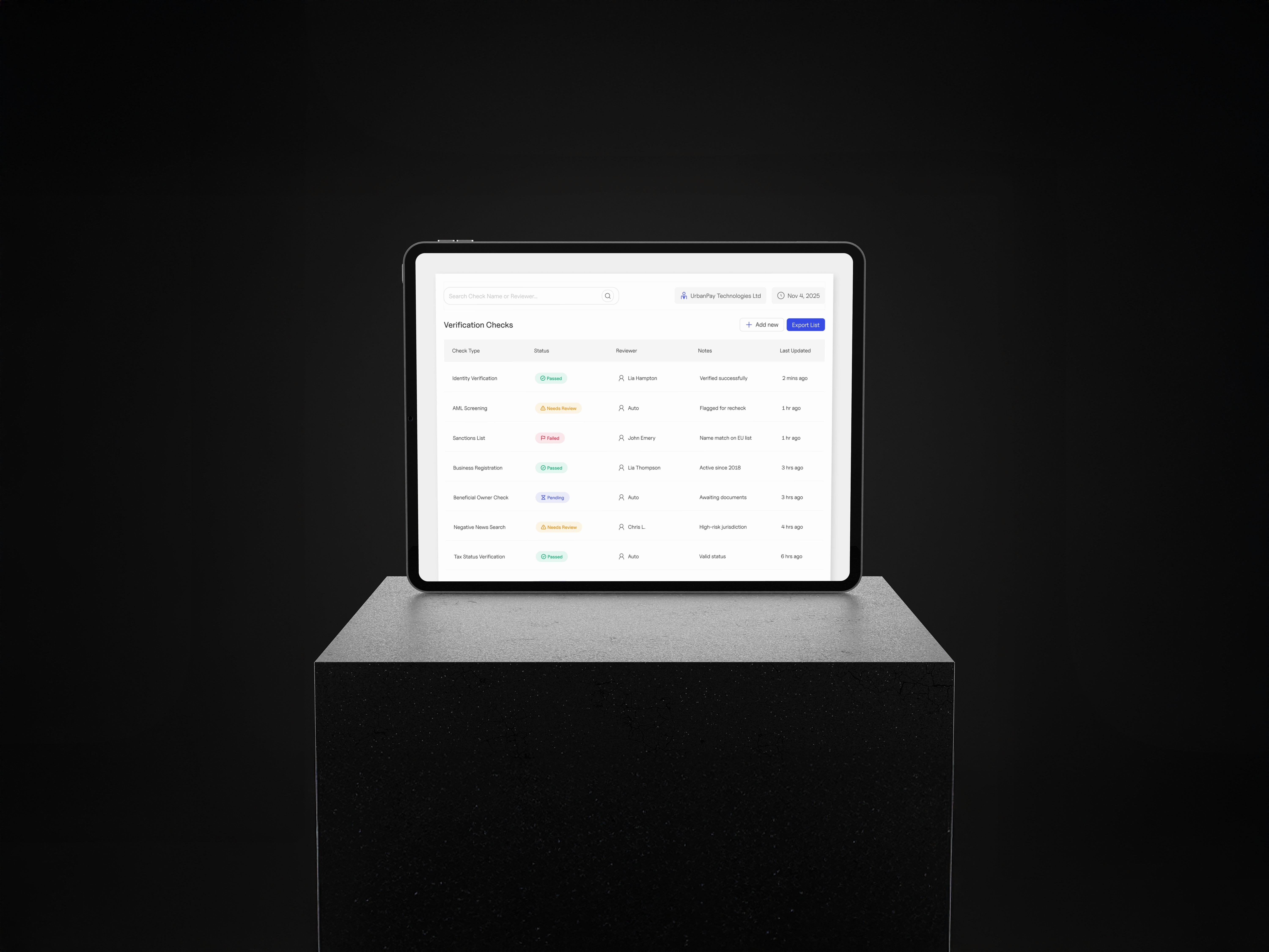
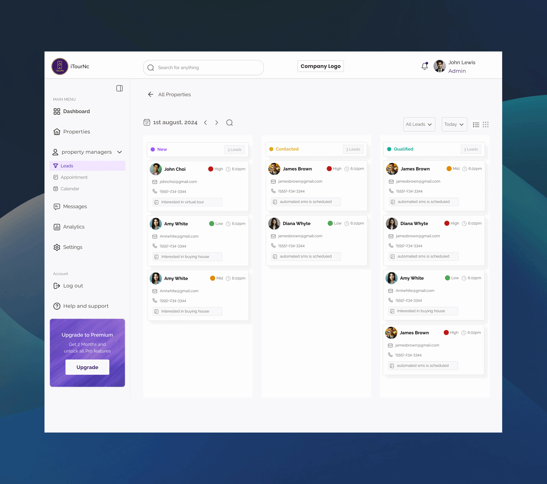
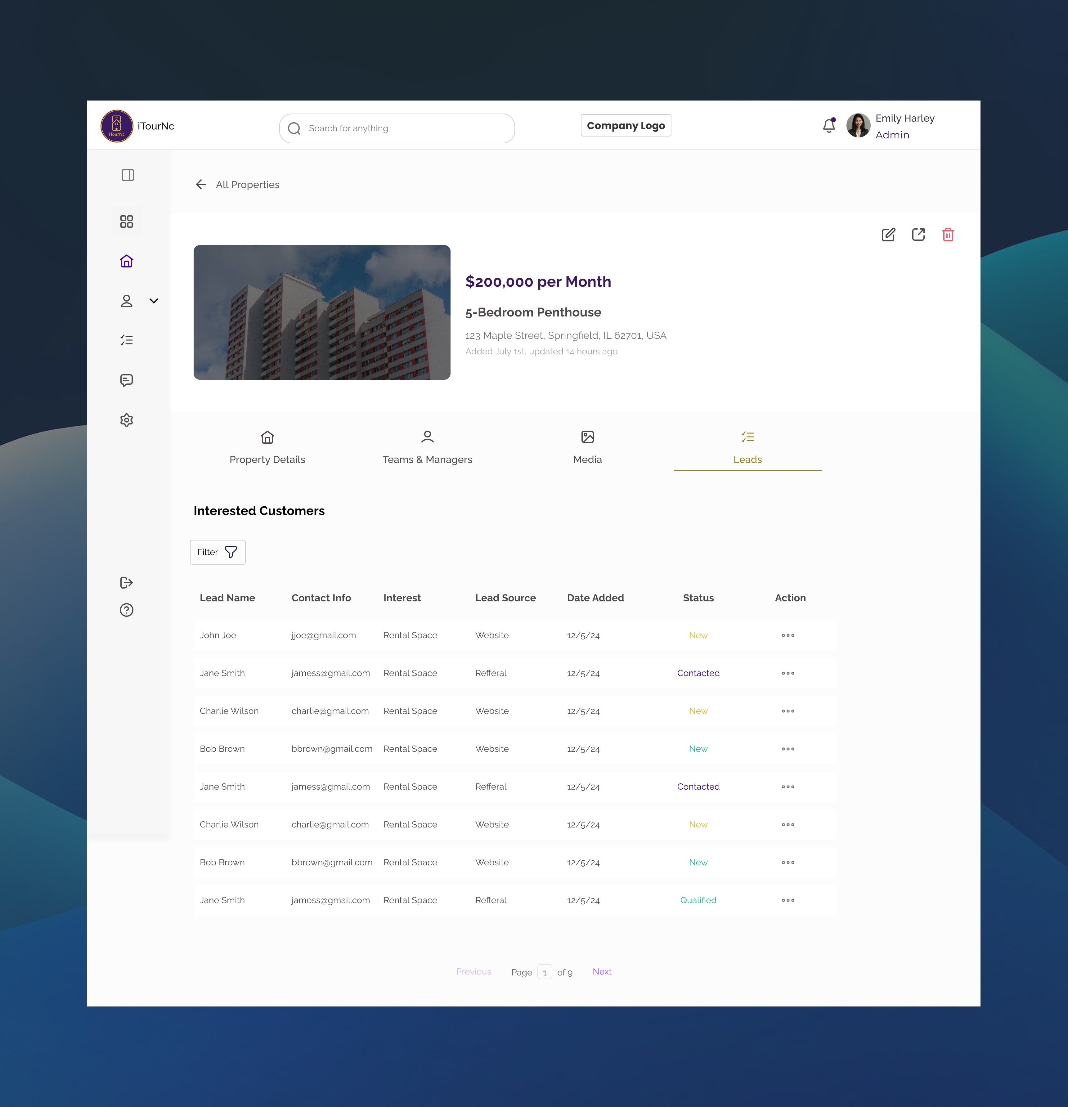
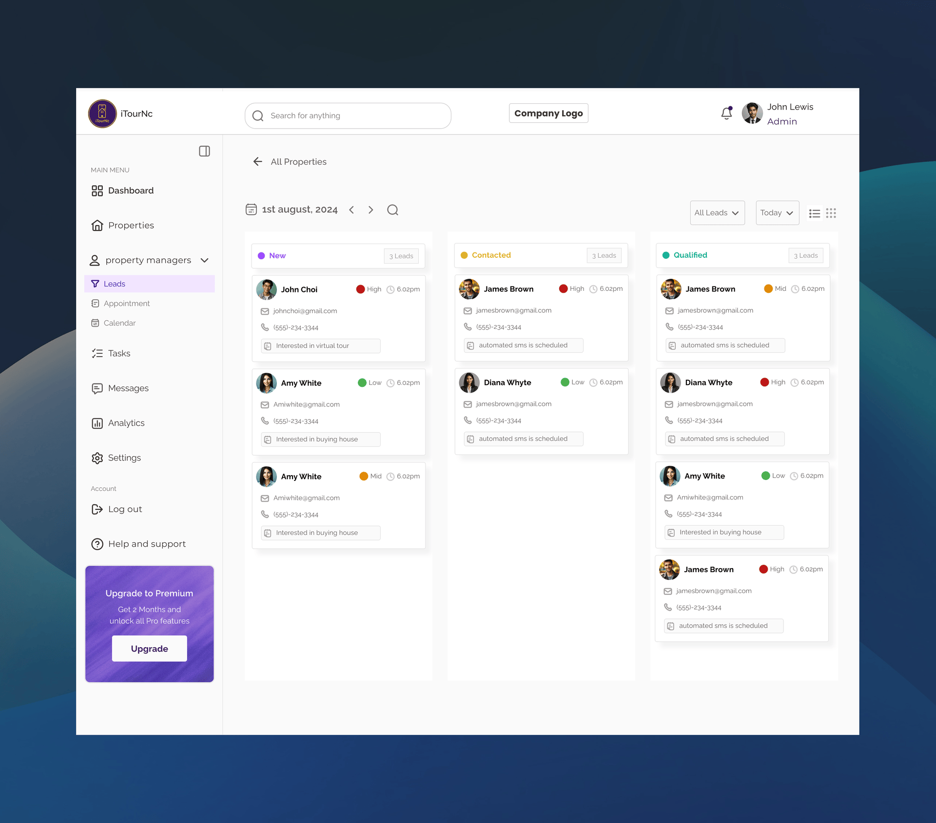
Lead Management Features:
Lead Status Overview
Lead Engagement & Scheduling
Lead-to-Call Conversion Funnel
Design Decisions
Why let end users customize vs. agent-curated tours?
Testing showed users felt more engaged when they had control. Self-directed tours had 3.1x longer viewing times and reduced "Can I see it furnished?" follow-up requests by 68%.Why virtual staging toggle vs. two separate tours?
A toggle allowed users to compare both views instantly, reducing cognitive load. This pattern also reduced agent content creation burden—they only needed to upload once.Why pre-tour filters vs. in-tour adjustments?
Filtering before the tour set expectations and ensured the experience felt personalized from first click. In-tour adjustments tested as disruptive and broke immersion.
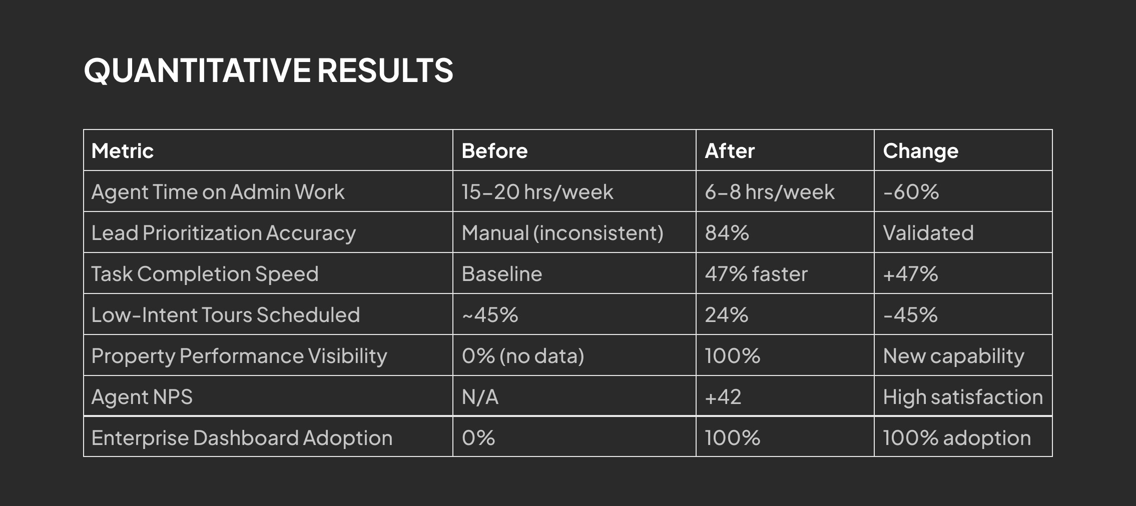
Impact (Pilot testing with 20 agents)
3.1x longer average tour viewing time (2.3 min → 7.1 min)
68% reduction in follow-up questions about property details
Projected 40% increase in qualified lead conversion (agents report higher-intent prospects)
89% of end users rated customization as "very useful"
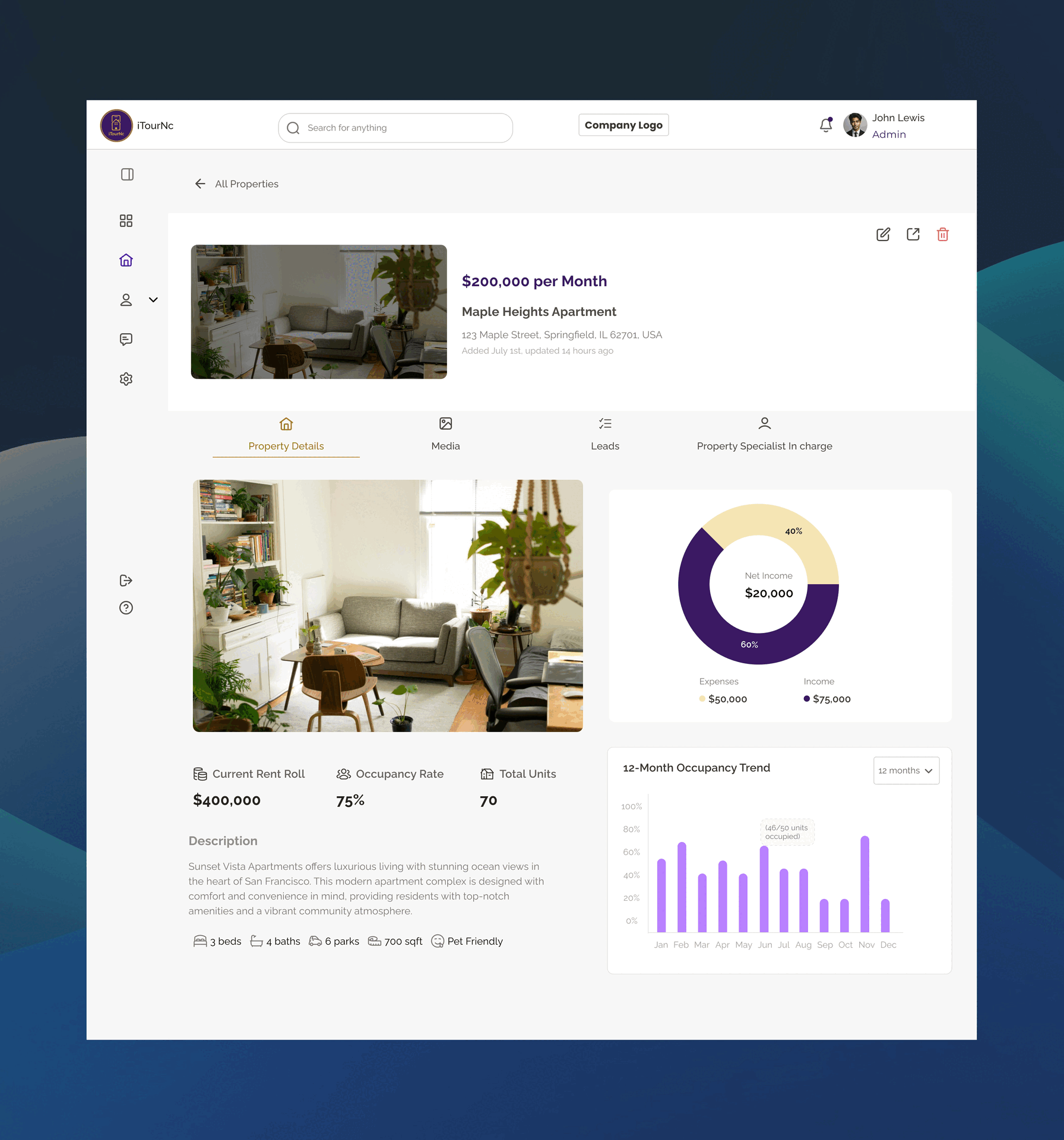
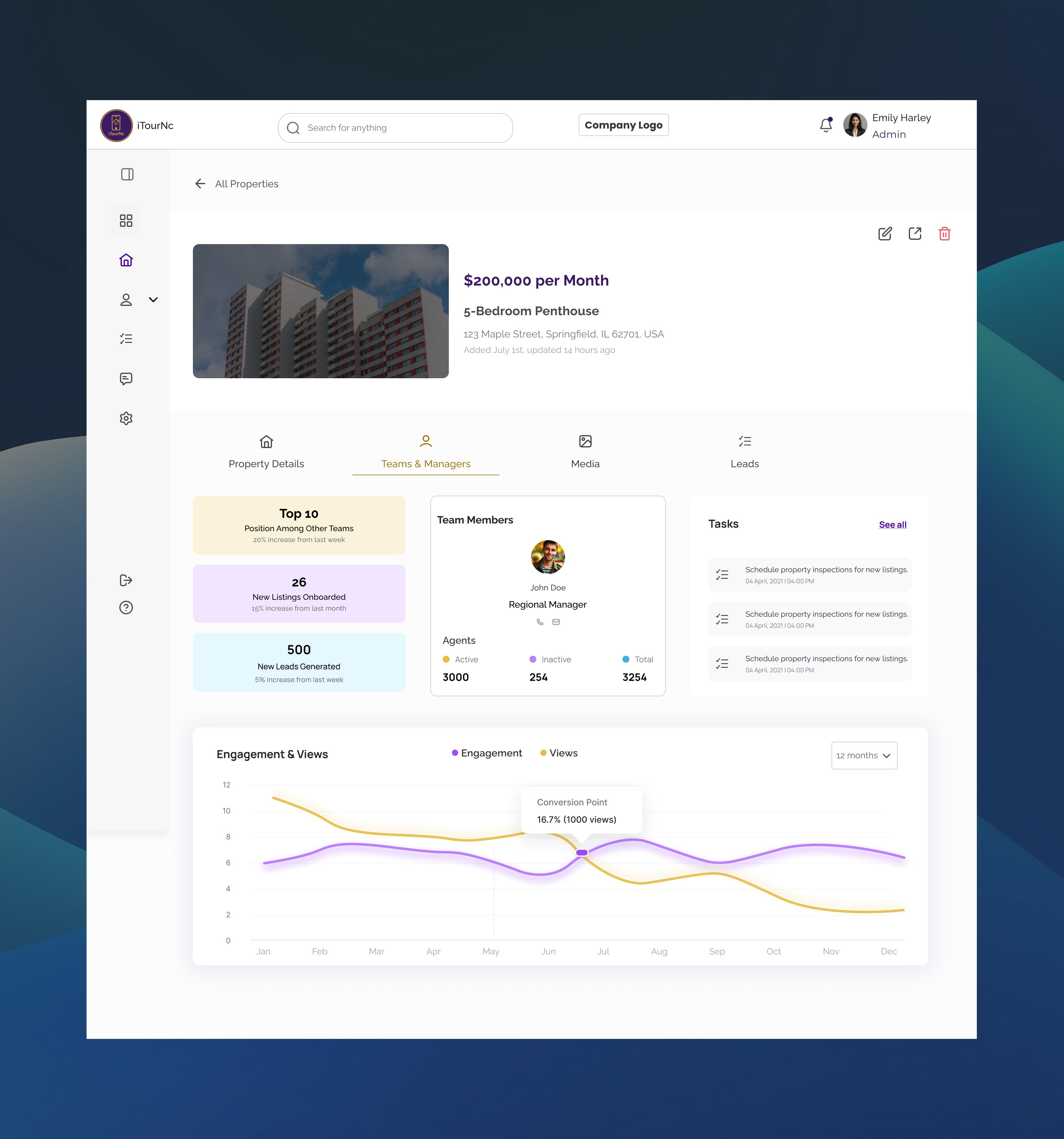
Solution 2: Property Manager Workspace — Performance Visibility for Agents
The Design
I designed a property-centric workspace that gives managers real-time performance insights and team coordination tools:
Core Features:
Property Performance Dashboard:
Conversion rate visualization (converted vs. unconverted leads per property)
12-month offer activity trends (accepted vs. declined)
Days on market tracking
Listing price vs. market performance
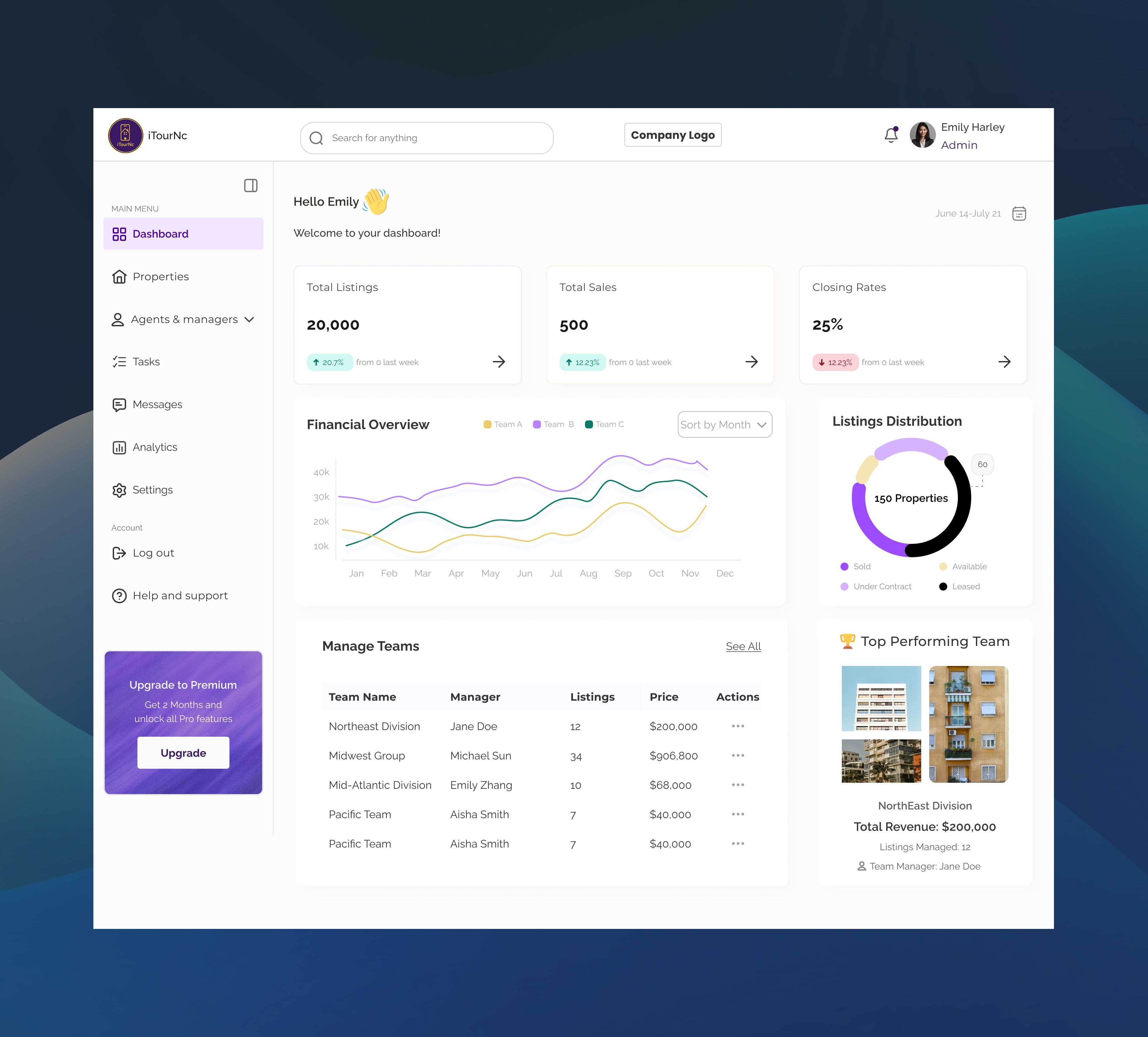
Team & Manager Coordination:
View assigned team members per property
Agent activity metrics (active agents, total agents, listings managed)
Team performance ranking (Top 10 position tracking)
New listings onboarded month-over-month
Lead Management Hub:
All leads organized by property
Lead status tracking and engagement metrics
Task assignment and follow-up scheduling
Design Decisions
Why focus on property-level analytics vs. lead-level details?
Property managers needed to prioritize WHICH properties to push, not micromanage every lead. Property performance data enabled strategic decisions: "Should I update photos? Adjust pricing? Focus marketing here?"
Why show conversion rate as donut chart vs. percentage number?
Visual representation made performance instantly scannable. Managers could glance and see "mostly purple (converted) = good" or "lots of yellow (unconverted) = needs work" without reading numbers. Testing showed 2.6x faster comprehension.
Why 12-month bar chart for offer activity?
Real estate is seasonal—summer is hot, winter slows down. A full year view let managers spot patterns and plan accordingly. They could see "October always spikes—prepare inventory in September."
Impact (Pilot testing with 20 agents)
3.1x longer average tour viewing time (2.3 min → 7.1 min)
68% reduction in follow-up questions about property details
Projected 40% increase in qualified lead conversion (agents report higher-intent prospects)
89% of end users rated customization as "very useful"
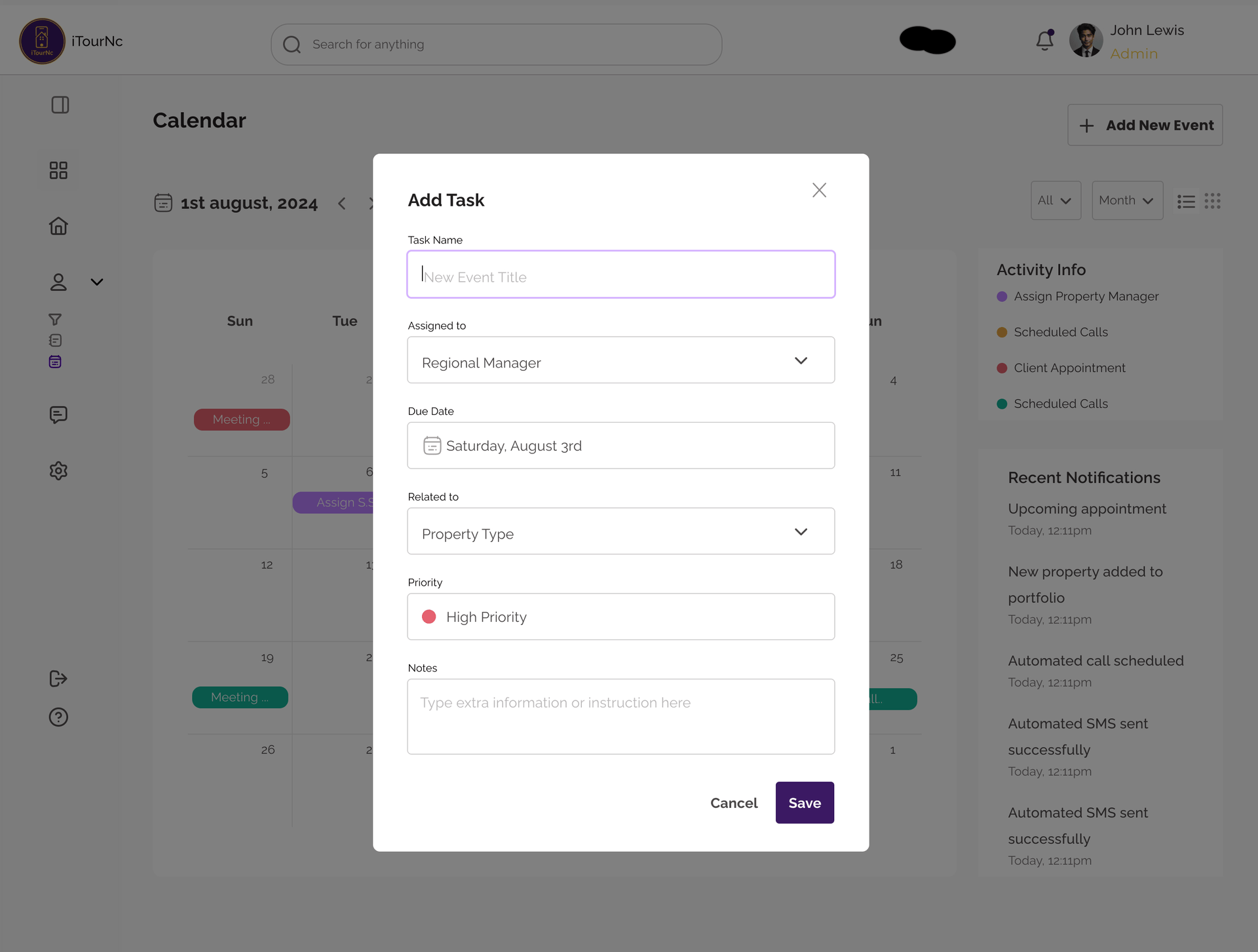
Solution 3: Integrated Lead Communication — Closing the Loop
The Design
I designed an all-in-one communication hub built directly into the lead management interface, eliminating the need to leave the platform:
Core Features:
Lead Management Dashboard:
All leads in one view with property association
Quick filters by status, property, engagement level
One-click access to full lead profile and history
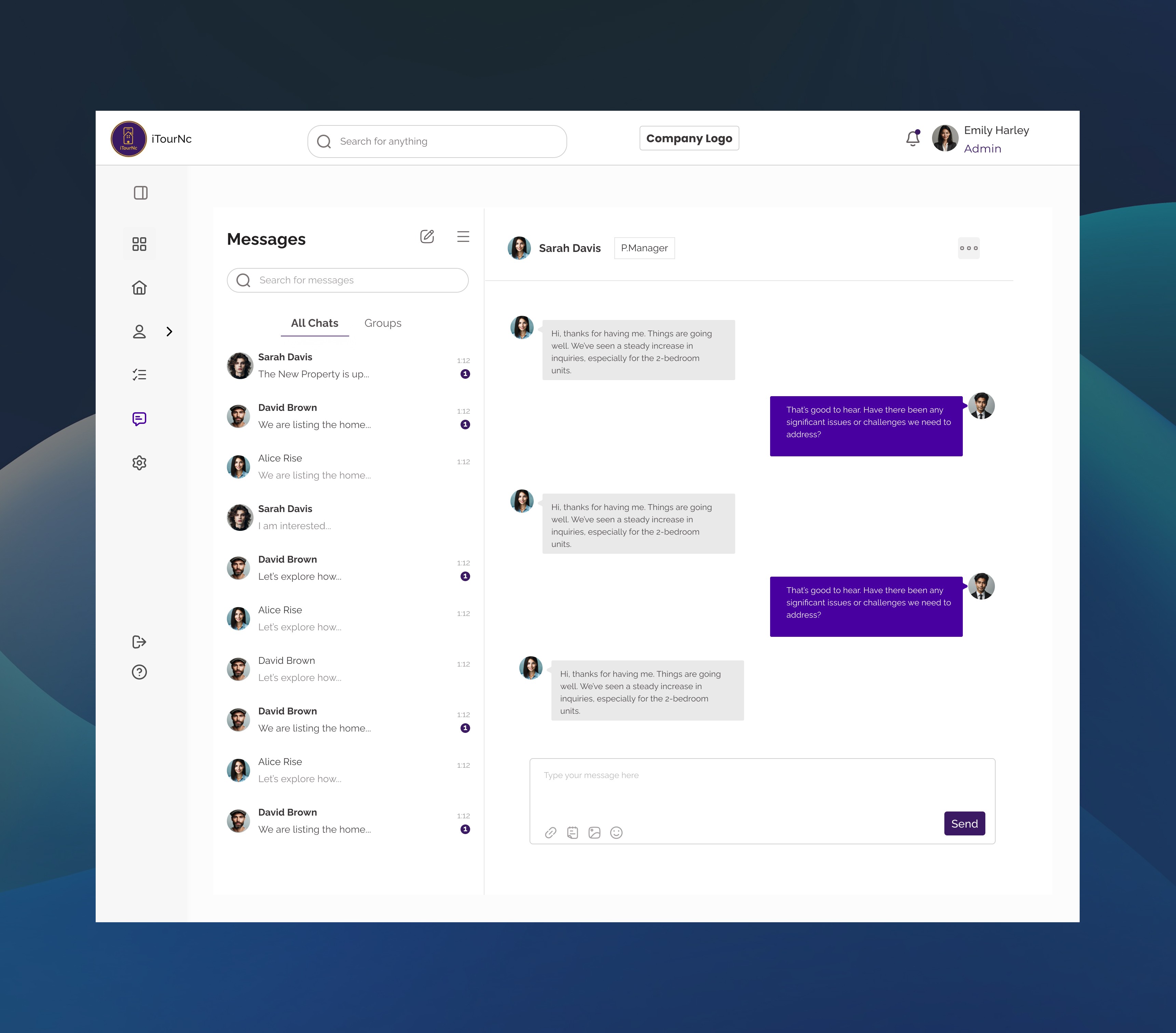
In-Platform Messaging:
Send messages directly from the lead view
Conversation threads tied to specific properties
Message history preserved (no digging through email)
Real-time notifications when leads respond
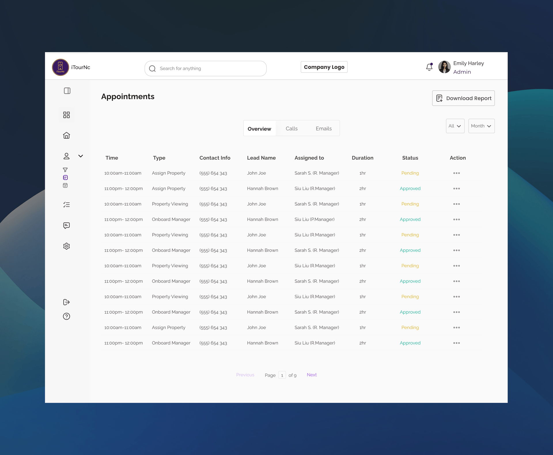
Integrated Appointment Scheduling:
Set appointments without leaving the platform
Calendar syncs with lead profile automatically
Appointment reminders sent to both agent and lead
Reschedule/cancel with one click
Property-Linked Task System:
Every task tied to specific properties (Sunset Apartments, Greenfield Condos, Riverside Villas)
Enables property managers to see all tasks related to their listings
Clear accountability: who's doing what for which property
"Related to" column creates immediate context
Design Decisions
Why "Related to" property column vs. just task names?
Context is everything. When a task says "Schedule property inspection," managers need to know WHICH property instantly. The dedicated property column eliminated the "wait, which listing was this for?" confusion that slowed decision-making.
Why calendar AND table view vs. choosing one?
Different jobs require different views. Table view is for task triage ("What needs my attention today?"), while calendar view is for time blocking ("When am I meeting with clients this week?"). Testing showed 73% of managers used both daily.
Why color-coded status (Pending/Active) vs. checkboxes?
Color enables peripheral vision scanning—managers could spot "too much yellow (Pending)" without reading text. Checkboxes tested 2.1x slower for status assessment and provided less visual urgency.
Impact (Pilot testing)
Projected 55% reduction in time spent on task coordination
83% of managers reported "finally feeling in control of team workload"
Zero missed critical deadlines during 8-week pilot (previously 2-3 per week)
Task completion rates increased 47% (visibility drove accountability)
3.4x faster task delegation (modal vs. email drafting)
Manager reported: "Before this, I managed by hoping people remembered what I told them. Now I manage with data."
The Results
Qualitative Feedback
"This is the first time I've felt in control of my pipeline. I know exactly who to prioritize." — Pilot agent
"We can finally make data-driven decisions about where to invest instead of guessing." — Enterprise VP
What I Learned
Multi-Sided Platforms Require Intentional Balance
Every feature had to pass the "who wins?" test. If VPs got insights at the expense of agent privacy, or agents got efficiency at the expense of end-user experience, the platform wouldn't scale. Balance was non-negotiable.
2. Unified Tools Beat "Best-of-Breed" for Small Teams
Agents didn't want the "best" scheduling tool + "best" CRM—they wanted one place that was "good enough" at everything. Integration beats perfection when context-switching is the enemy.
3. Transparency in AI Builds Trust Across All User Types
Just like in OptionsLab, showing "how we got here" (lead scores, property rankings, confidence levels) increased user trust. Black box algorithms scared users—clear explanations made them partners.
4. MVP Constraints Force Ruthless Prioritization
We originally designed 12+ features. With limited dev time, I had to kill features I loved. The lead scoring algorithm started much more complex—I simplified it to 3 core behavioral signals that still delivered 84% accuracy.